🚧
Confidential. Please do not share any media. This is purely for your perusal alone.

Introduction
This case study ventures into how we went about adding DigiOD (or Digital Overdraft if we're being un-savvy) feature to the IRIS Biz App.
Context
IRIS Biz is YES BANK's next-gen app for business customers. During the MVP stage of the app, I worked as the secondary designer on a two-person team. However, when Phase 2 began, I stepped up as the primary designer, taking on full responsibility and accountability (yay, fun!).
Through some research and the predetermined rules we established during the MVP phase, we identified some factors to consider while crafting the DigiOD experience:
The core audience primarily uses DigiOD for working capital.
Users typically apply for overdrafts at the last moment, rather than planning ahead.
Users do not complete the process in one sitting.
Not all users are familiar with DigiOD and its offerings.
With these considerations in mind, we began working on the requirements.
Designing or redesigning
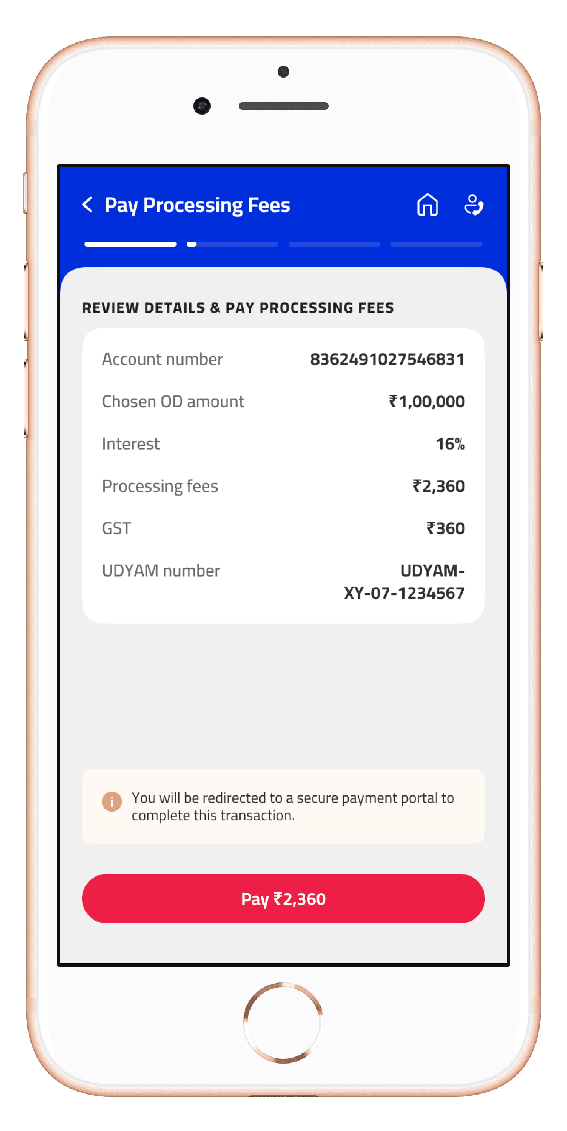
The DigiOD application process had already existed as a desktop portal for quite some time, which gave us some leave on figuring out what already worked. For instance, the required input fields had been iterated multiple times, arriving at an optimal set.
To counter one of the major problems we had identified — unfamilarity around the product — we decided to prominentaly showcase DigiOD on the homepage with a banner. Featuring a short, catchy heading with compelling number offerings along with a subline to explain its benefits, the banner provided an engaging introduction to the product.

Banner touchpoint

CTA updates to 'resume'
Once we had successfully engaged the customer through the banner, the next step was to guide them through the application process — i.e. ensuring they completed it.
To support users, we introduced steppers into the process. These acted as save points, allowing users to pause and return later. To further aid this, we included a clear CTA in the banner to nudge users who left the application midway.
To tackle the issue of urgency, we showcased the product as an offer with timed limits, creating a sense of immediacy for users.
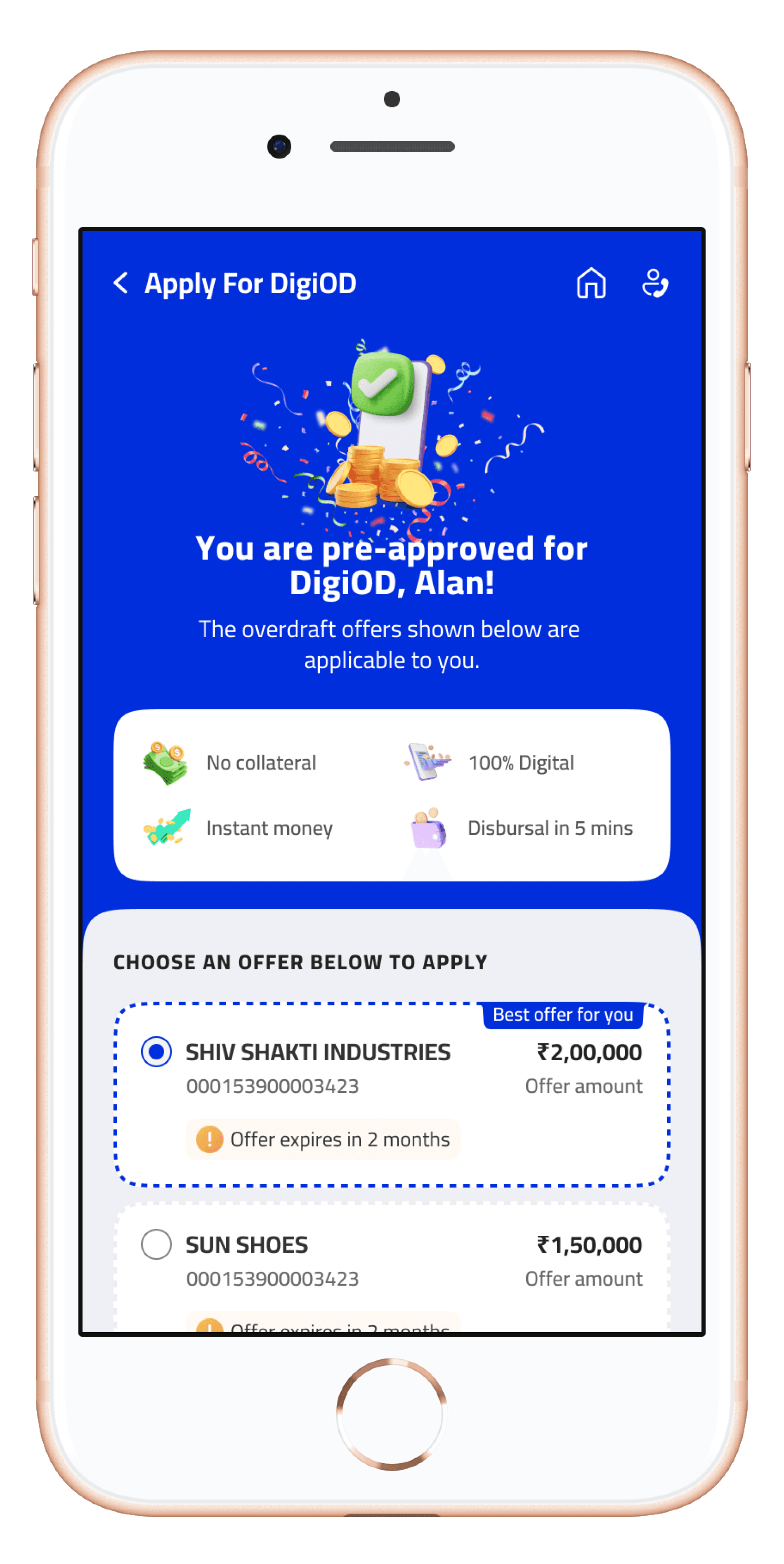
Nudges provide a sense of urgency
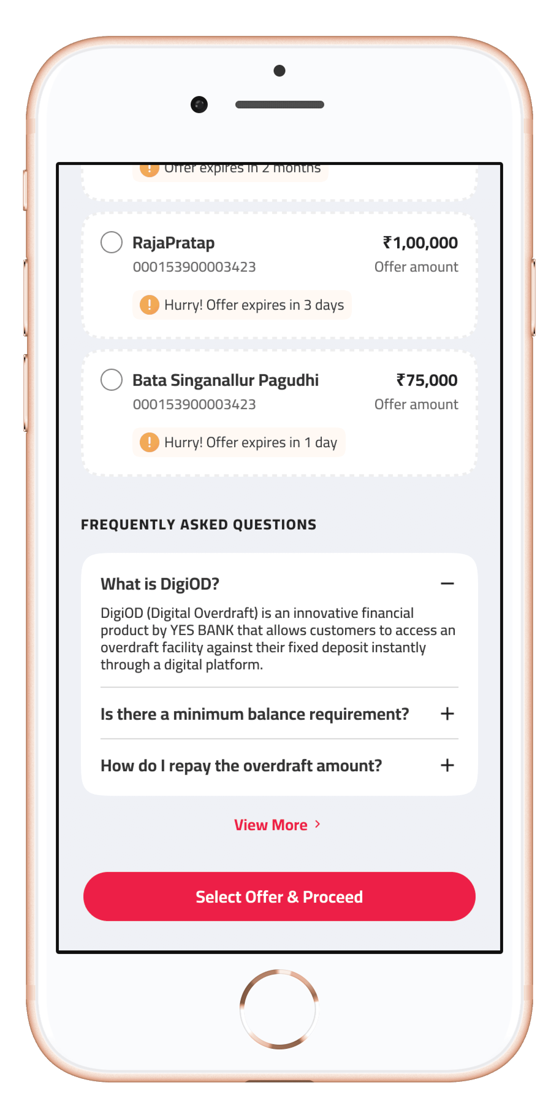
FAQs to help aid new users
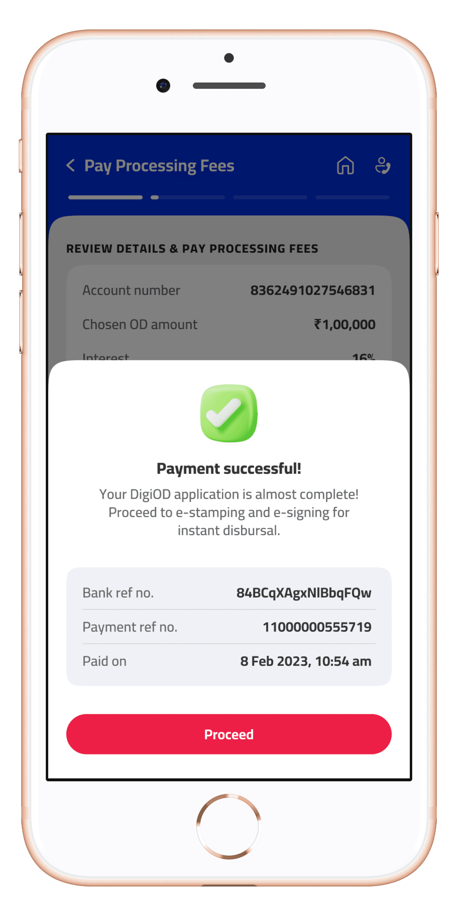
Putting it all together, we designed a flow with minimal friction. The only mandatory input was a slider to choose the desired amount, with everything else managed via simple confirmations on CTAs.
Although the functionality to resume the application at any point was shelved for future implementation, the stepper approach has been retained, ensuring we can get back to implementing 'resume' at a later date.